Responsive eForm
When selecting the Responsive Form option, users can create a responsive form that gets accustomed to display in a responsive view without the background image and fields within the eForm get displayed as plain HTML text. When the Responsive Form option is not selected, the eForm does not support mobile, tablet, or any responsive view.
Click Responsive Form. The Create eForm page appears.
Enter the following details in the Create eForm fields:
|
Field |
Description |
|---|---|
|
Form Name |
A name for the eForm. |
|
Form Code |
A unique 5-character alphanumeric code that helps iSeries applications such as SWS to identify eForms. |
|
Form Description |
A description for the eForm. The description must not exceed 160 characters. |
|
View Name |
Select the preferred view from the drop-down list. Views created for folder appears here. |
|
Language |
Select the preferred language from the drop-down list:
|
|
Select a Configuration Link |
Select the eForm configuration name that is used to link multiple eForms. The values in this field are auto-populated on creating the eForm configuration name in eForms Admin. |
|
Submit eForm when signed |
When enabled, the eForm is submitted automatically upon clicking Finish. |
|
Download eForm after Submission |
When enabled, provides end users with the option to download the eForm as PDF after submission. |
|
Send Email after eForm Submission |
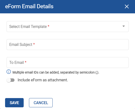
When enabled, allows users to send the eForm link to users through email. When enabled the Click to edit Email details button appears. Clicking this button displays the eForm Email Details pop-up.
|
|
Enable Password Protection |
|
|
Click to config OTP Details |
A new button, Click to config OTP details, has been added in the left pane which displays the Password Protection Details pop-up where users can configure the SMS and email OTP messages. This button will be displayed only if the Enable Password Protection flag is enabled. For more information, see the OTP Verification for eForms section under eForms ➜ Features in eForms in this document. |
Modify the eForm using the design field options available on the right pane.
Users can drag and drop the preferred design options on to the responsive form using the following:
-
Text Field
-
Text Area
-
Date Picker
-
Numerical
-
Social Security
-
Currency
-
Phone Number
-
Email
-
Dropdown
-
Radio Button
-
Checkbox
-
Signature Capture
-
Attachment
-
Hyperlink
-
Auto ID
-
HTML Renderer
-
Column Separator
-
Section
-
Hidden Text
-
Content
-
Webcam
-
Pictorial Selection
-
Header Section
-
Theme
-
Rules
-
Advanced Properties
-
Default Properties
-
Field Properties
For more information on the design options, refer to the Annotation Design Options section in this guide.
Users can move and arrange the fields using the Drag icon available on the field. Users cannot move hidden fields. Once the form is designed, users can submit and save the changes. The created eForm appears in the eForms section.
Click Save to save the eForm as draft.
Or
Click Finish to finalize the eForm and store a version of the same in Version History.
Or
Click Close to close the eForm.
Annotation Design Options
Users can access the following design options to add fields in eForms:
Refer to the following table and fill in the fields:
|
Field |
Description |
|---|---|
|
Text Field |
Allows users to add a text field box that helps end users input alphanumeric values (including symbols). End users can modify the height and width of the text field box. The maximum character length must not exceed 255 characters. Users must be able to provide a display text if the eForm is not linked to any index field. The display text must not exceed 50 characters (Alphanumeric only). Users can opt to enable or disable this field as a mandatory field. |
|
Text Area |
Allows users to add a text field box that helps end users input alphanumeric values (including symbols) in multiple lines. End users can modify the height and width of the text field box. The maximum character length must not exceed 500 characters. Users must be able to provide a display text if the eForm is not linked to any index field. The display text must not exceed 50 characters (Alphanumeric only). Users can opt to enable or disable this field as a mandatory field. |
|
Date Picker |
Allows users to add a date picker that helps end users input the day, month, and year with or without any one of the following symbols:
End users can modify the height and width of the date picker. Users must be able to provide a display text if the eForm is not linked to any index field. Users can opt to enable or disable this field as a mandatory field. Manual Date Entry in eForms Guests can manually type or enter the date in the date picker. While doing so, guests must manually add separators (Hyphen, Forward Slash, Dot, Space) as preferred while entering the preferred date in date picker fields. Predefined separators can be configured while creating or modifying an eForm from the Create eForms and Edit eForms screens. Guests cannot enter any special character as separator other than what is displayed in the date format place holder. Earlier, guests were allowed only to select the preferred date from the date picker field. |
|
Numerical |
Allows users to add a number field box that helps end users input numeric values with or without the following symbols:
More than one dot cannot be entered by the end users. The height and width of the number field box can be modified. Users must be able to provide a display text if the eForm is not linked to any index field. The display text must not exceed 50 characters (Alphanumeric only). Users can opt to enable or disable this field as a mandatory field. |
|
Social Security |
Allows users to add a number field box that helps end users input the social security number with or without a hyphen (-). The maximum character length must not exceed 9 characters without a hyphen. The maximum character length must not exceed 11 characters with two hyphens. End users can modify the height and width of the number field box. Users must be able to provide a display text if the eForm is not linked to any index field. The display text must not exceed 50 characters (Alphanumeric only). Users can opt to enable or disable this field as a mandatory field. Displaying Last 4 Digits of SSN When the Social Security field is added while creating an eForm, the last four digits of the SSN number are displayed, and the remaining numbers are masked as part of the PII data. This is to secure the personal information in the document when retrieved by the integrating product/application. In the Social Security indexing field, the complete SSN value must be displayed without masking. Once masked, guests along with the property agent will not be able to see the SSN.
|
|
Currency |
The Currency field supports the following field properties:
Users can configure the round off decimal places for the currency up to 4 decimals or no decimal. |
|
Phone Number |
The Phone Number field supports the following field properties:
Following symbols and characters are supported when users enter the phone number:
The country code is displayed in the phone number field based on the country selected from the drop-down list. Users are not allowed to enter more than 10 digits and users are not allowed to enter symbols other than the supported symbols. Users must drag and drop the Phone Number field on to the E-Form when creating a PDF E-Form. Select the field and click Field Properties to display the Properties pane. |
|
|
Allows users to add a text field box that helps end users input alphanumeric values (including symbols). End users can modify the height and width of the text field box. The maximum character length must not exceed 255 characters. Users must be able to provide a display text if the eForm is not linked to any index field. Users can opt to enable or disable this field as a mandatory field. |
|
Dropdown |
Allows users to add a drop-down box that helps end users select an option from the drop-down list. End users can modify the height and width of the drop-down box. The maximum character length must not exceed 255 characters. Users can opt to enable or disable this field as a mandatory field. |
|
Radio Button |
Allows users to add one or more radio buttons in the form. |
|
Checkbox |
Allows users to add one or more checkboxes in the form. |
|
Signature Capture |
Allows users to add a signature box that helps end users enter their signature. End users can modify the height and width of the number field box. Users can opt to enable or disable this field as a mandatory field. |
|
Attachment |
Allows users to add an attachment box that helps end users attach documents on the eForm. The Attachment box displayed on eForms appears with a green outline. Users can opt to enable or disable this field as a mandatory field. |
|
Hyperlink |
Allows users to add hyperlinks that help end users to access the hyperlinks while filling eForms. Users can add as many hyperlinks as required. |
|
Auto ID |
Allows users to add an alphanumeric field to auto-generate a unique ID (for example, Purchase Order number) when end users open an eForm with the Auto ID field configured. The generated Auto ID must contain 6 alphanumeric characters which include 2 alphabets and 4 configurable numbers. For example, AA0000 The Auto ID generated ranges from AA0000, AA0001 and automatically increments until it reaches ZZ9999. |
|
HTML Renderer |
Allows users to add a text field box to populate any dynamic HTML content such as line by line text or a table of text which cannot be fit into any other eForm field type. The data is sent from the integrated application in HTML format which must be displayed as text on the eForm without altering the alignment of the received content. |
|
Column Separator |
Allows users to split the layout into multiple columns. |
|
Section |
Allows users to group multiple controls. When guests open the eForm, the controls added within the section will be displayed within a rectangular section. To group fields, users must drag and drop the Section control first and then drag and drop the preferred controls in to that section. |
|
Hidden Text |
Allows users to enter the text that can be hidden in an eForm. |
|
Content |
Allows users to add preferred content in an eForm. |
|
Webcam |
Allows guests to access camera from the eForm and upload images directly. The maximum allowed file size is 4 MB and following are the supported image formats:
|
|
Pictorial Selection |
This annotation allows users to select one or more options by clicking images. This form designers create more visual and intuitive form experiences, especially when users need to choose from image-based options such as icons, diagrams, or visual preferences. Administrators and form designers can configure a Pictorial Selection field with image options. Each image works as a selectable input and follows the configured selection type. This field supports the following image formats: JPEG, JPG, PNG, and SVG. The maximum allowed file size is 500 KB. |
Users can select multiple fields at a time by performing Ctrl + left click on the desired fields.
Users can also copy (Ctrl + C) and paste (Ctrl + V) multiple fields within the eForm.
Click the following icons to manage the design fields if required:

|
Field |
Description |
|---|---|
|
Reset eForm |
Allows users to reset the eForm. |
|
Responsive Preview |
Allows users to view the eForm in a responsive view on the browser tab. |
Map eForm fields to predefined indexes using the Field Properties option.
Click Create. The eForm is created.